Analysis of North Carolina State House Districts
Published January 30, 2020
With the upcoming North Carolina primary elections on March 3, and with the state legislative and congressional district maps finalized for the 2020 election, here's a look at the North Carolina House of Representatives districts for where things stand at the beginning of the year, and the possible classifications for each district come November.
My approach to classifying districts is based on their partisan behavior, meaning the categories use a combination of factors: presidential results within the district; voter registration percentages (party registration and racial demographics) from the January 11, 2020 registration file from the North Carolina State Board of Elections; and the district's 'regionalism,' namely the percentage of registered voters in center cities (urban counties), outside of the center city but still inside an urban county, a surrounding suburban county, or a rural county.
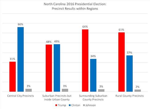
First, to give a sense of how the four regions performed as a whole in the 2016 presidential election, this chart gives the four regions and their state-wide performances:
Much has been discussed in national commentary about the great urban-rural divide (and not just in the United States apparently), but in North Carolina, there is a more nuanced approach to the political behavior of the urban/suburban/rural counties of the state. Within urban counties, one can consider that there are two different types of communities: the central city that anchors the urban region, and the area outside of the central city but still inside the urban county. For example, those cities and towns (Huntersville, Mint Hill, Davidson, Pineville) inside Mecklenburg County that are outside of Charlotte's city limits, and that are more 'suburban' in nature.
In looking at how the precincts performed in the 2016 presidential election, central city precincts were overwhelming Democratic, at almost a two-to-one advantage. Within those urban counties but outside the central city, we see the most competitive region: nearly a fifty-fifty split between Democrats and Republicans at the presidential level. This 'suburban inside an urban county' region acts like national narrative of the 'suburban battlegrounds.' However, North Carolina's surrounding suburban counties are the most Republican of the regions, presenting a reverse image of central cities. Finally, the state's rural counties are indeed more Republican, but not as GOP dominate as their suburban county counterparts.
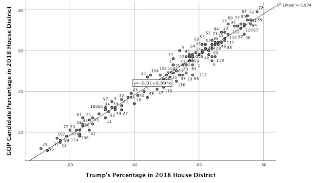
While these regions give a sense of how the state has become divided, the political behavior of each legislative district votes is strongly related to how it voted at the "top of the ticket" in the presidential election. For this, I took each legislative district's 2016 vote for Donald Trump (based on data acquired here) and compared it to the GOP candidate's performance in that same district. For this analysis on the state house of representatives, the following scatterplot shows how Trump's 2016 vote percentage is closely connected in each district to the vote percentage for Republican candidates in 2018.
With an adjusted r-squared value of 0.974, there's almost a perfect relationship between Trump's vote in 2016 and the GOP candidate's 2018 vote in the state house districts.
With this as a basis (and a similar relationship between Trump's 2016 vote performance and the state senate district's GOP candidates in 2018, that I'll show in the next blog piece), I hypothesize that even with the change in district lines, the relationship between Trump's vote performance should remain close to the GOP candidate's vote performance come this fall (and a reminder: not all of the state house or senate district lines were revised in this most recent map).
The classification primarily relies on how Trump 2016's presidential vote performed in the new district, and breaks the classification into five categories:
- Safe Republican: voted over 55 percent for Trump in 2016
- Lean Republican: between 50 and 54 percent for Trump in 2016
- Competitive/Toss-Up: these are closest districts, usually 48-49 percent for either party's presidential candidate
- Lean Democratic: between 50 and 54 percent for Clinton in 2016
- Safe Democratic: over 55 percent for Clinton in 2016
I also took into account consideration each district's party registration, the racial composition of the registered votes, and the regionalism of the district, and came to the following classifications:
- Safe Republican districts: 58
- Lean Republican districts: 11
- Competitive/Toss-Up districts: 4
- Lean Democratic districts: 11
- Safe Democratic districts: 36
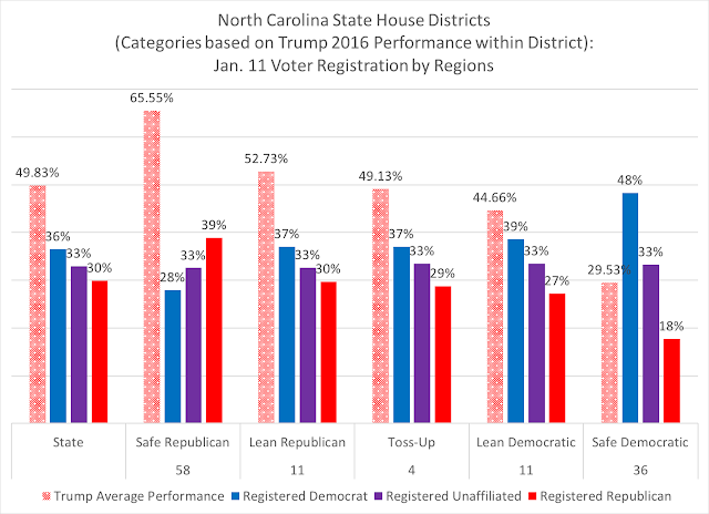
In looking at the presidential performance (Trump vote) within each of these categories, along with the party registration as of January 11, 2020, you can see some distinct differences within each category:
The first part of the above chart is the state comparison data, showing that Trump received 49.83 percent of the 2016 vote, while the party registration for the state is 36 percent registered Democratic, 33 percent registered unaffiliated, and 30 percent registered Republican. In looking at the "Safe Republican" districts that had a Trump vote performance of over 55 percent, the average was 65 percent, sixteen points above the state performance, with registered Republicans at nearly 40 percent.
In comparison, the "Lean Republican" districts are only 3 points ahead of Trump's state-wide average in his performance, with a voter party registration that is almost exactly the state's breakdown. The "competitive/toss-up" districts are also nearly identical in both Trump's average performance and party registration to the state numbers.
Moving into the possible Democratic districts, the "Lean Democratic" have an average Trump performance of five percentage points below his state performance, with a higher registered Democratic advantage and lower Republican registration. The "Safe Democratic" districts see a twenty-point deficit in Trump's performance compared to his state performance, with nearly half of the registered voters aligned with the Democratic Party.
In looking at the racial composition of these districts within the five categories, you can see again distinct differences:
The "Safe Republican" district are twelve points more white than the state, and nine points less black/African-American. The "Lean Republican" districts are nearly identical to the state, while the toss-up districts are less white by seven points. The "Lean Democratic" districts are slightly more white than the toss-up districts, but the "Safe Democratic" districts almost majority-minority in voter registration.
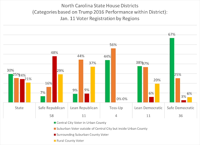
Finally, the regionalism components of the districts within each of the five categories:
The "Safe Republican" districts are almost 50 percent within the 'surrounding suburban counties' (the most Republican areas of the state), while the "Lean Republican" districts are a strong mix of competitive 'suburban within urban counties' and rural counties. The toss-up districts are urban, but slightly more 'suburban-urban' than 'central city,' while the "Lean Democratic" are a mix of mostly urban areas, and the "Safe Democratic" districts are two-thirds central city.
Here is a Google spreadsheet with the relevant data for each state house district, as of January 11, 2020's voter registration data, along with its specific classification based on the above factors.


